


Color gamut of pictures for the monument
Why are not all colors available on photoceramics?
We are in the 21st century, technology and computer graphics are developed at a high level. It seems that nothing is impossible. So why is this - it would seem - simple thing, which is the perfect reflection of colors on porcelain, not so obvious? Producers of photoceramics have to make a compromise between saturated, beautiful, sometimes even bright colors, and the unchanging durability and full resistance to weather conditions of the colors fired on porcelain. Unfortunately, the quilt is short and you have to take into account the limited color gamut of ceramic paints.
Color gamut is a term used in the context of color reproduction, especially when it comes to computer graphics or photography. Gamut, or color space, is the range of colors we can see or obtain in print.
Why do the colors on the photoceramics do not perfectly reflect the colors seen on the monitor? Can't a photoceramic producer just add more saturation to boost the color on the porcelain?
The reason for the imperfect color reproduction on photoceramics is the narrow color space of ceramic paints. Porcelain photography producers use specialized inorganic paints to achieve a permanent image that will not fade even after many years of exposure to changing weather conditions, such as intense sunlight. Unfortunately, the use of this type of paint has a drawback - the color gamut of the inks used for the production of photoceramics is even smaller than the color space of standard print or the range of colors visible on an average-class computer monitor.
How big is the difference? The graphic below simulates the range of colors that can be achieved in printing using the CMYK color space in combination with the range of colors that can be obtained after printing and burning on a ceramic plate. At first glance, you can see that the color gamut in which photoceramics manufacturers operate significantly limits their possibilities of perfect reproduction of all colors. Unfortunately, adding more toner will not increase the color saturation. Adding more saturation to the file will not change the range of colors that can be obtained after printing and firing photoceramics.
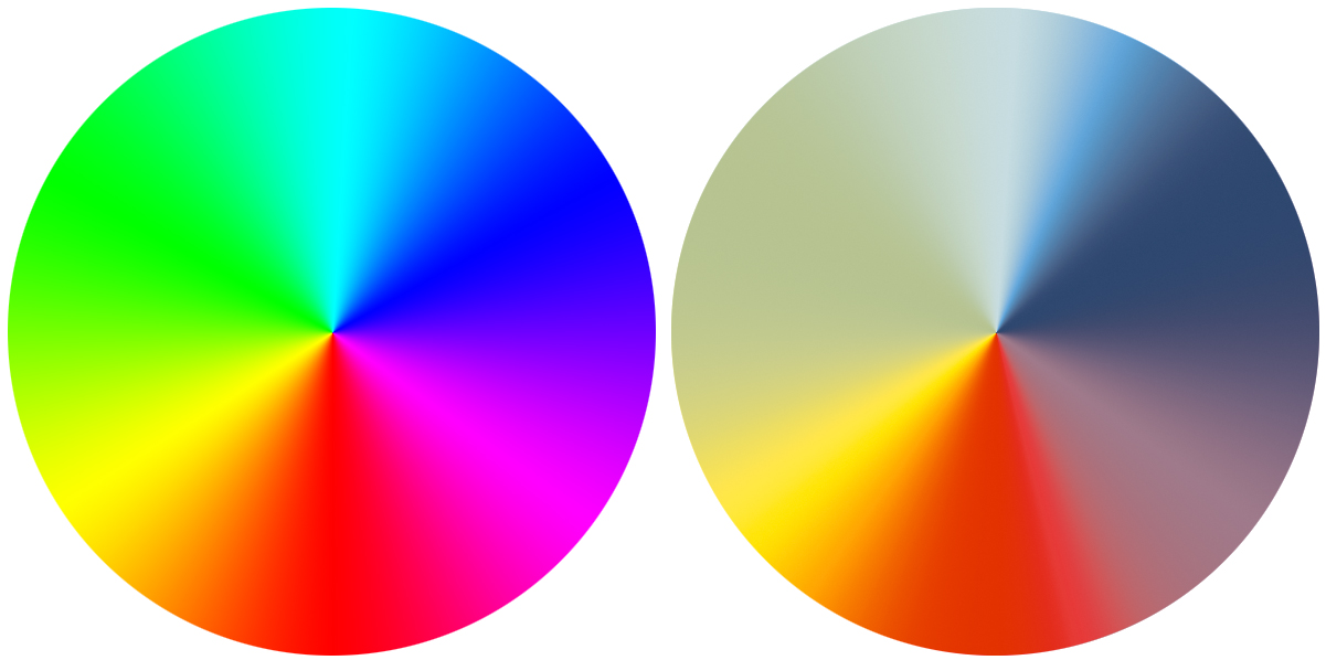
Fig. Colors that can be obtained in print (left) and on photoceramics (right) using the same graphic file.
We can also see the differences in the graphic below. On the left there is a graphic file, in the center there is a picture of porcelain, and on the right is a crystal with the exact same file burned out. Despite the fact that the photos do not reflect the colors as accurately as the human eye will observe it "live", there is certainly a difference in brightness and saturation of many colors.
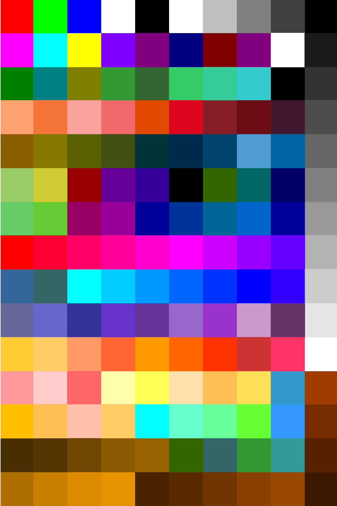
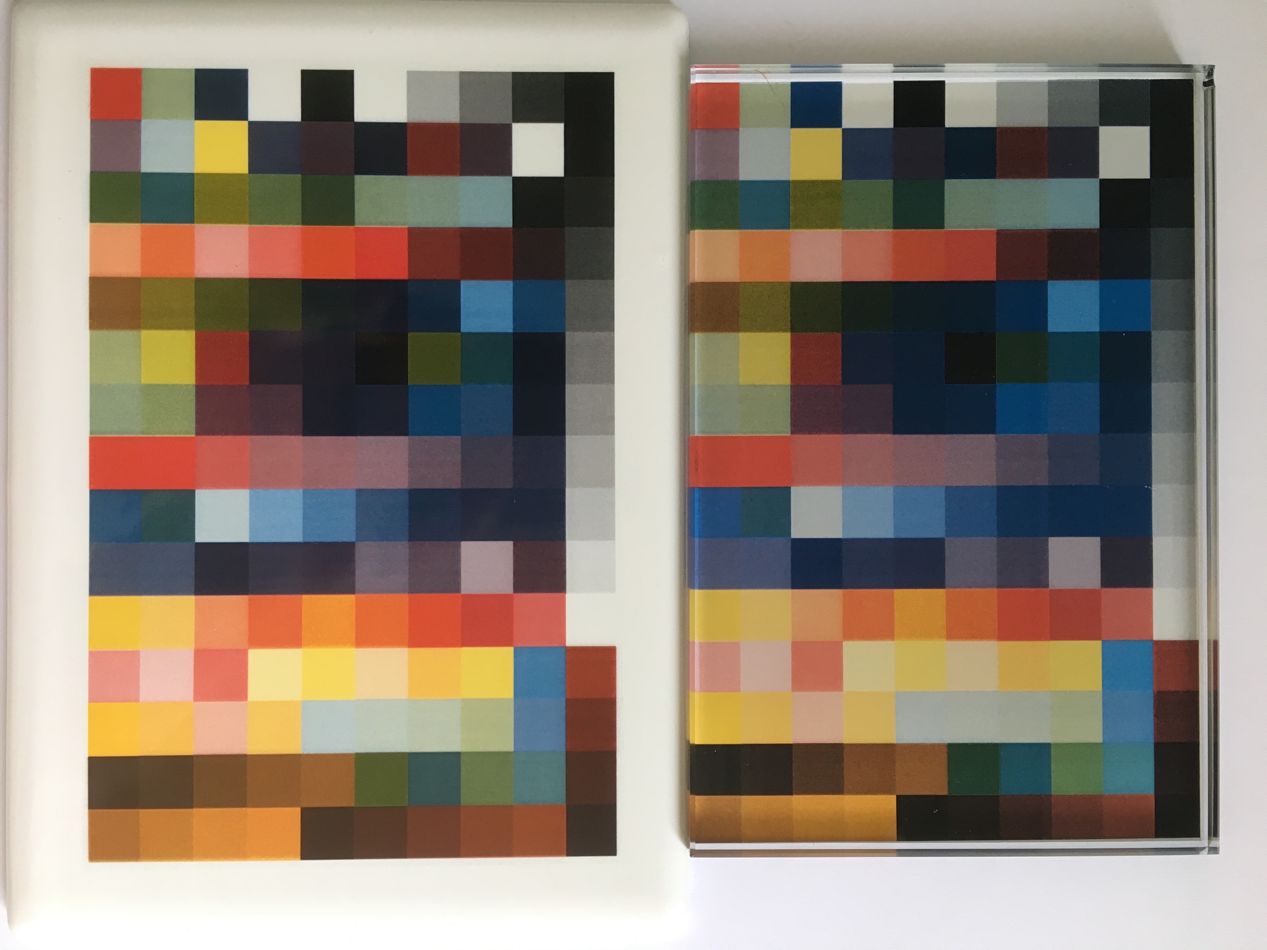
Fig. On the left the original graphic file, in the center a file burned on porcelain, on the right one burned onto a crystal.
Let's use the sample photo to understand these differences even better. On the left side you can see very intense green eyes, pink lips, the blue background is very saturated. The photo on the left has been artificially supersaturated and colored to show the differences in color saturation. The photo on the right simulates the colors that we get on photoceramics if the same file is printed and burned. The colors are not as intense and vivid as we see them on the monitor or with standard printing using organic pigments.

Fig. Simulation of the color difference between a photo printed in the CMYK color space (left) and photoceramics (right).
The color space in which the producers of photoceramics move is very narrow, but many years of experience in working with ceramic toners allows to minimize the differences between the initial photo, and that on porcelain.
The above simulations are intended to illustrate the differences in the color of photoceramics and standard printing due to the color gamut. The color differences are large, so if the manufacturer sometimes proposes to change the color of the blouse or lips, it is worth trusting specialists to achieve the best result.
Experienced producers of photoceramics are able to choose the colors in such a way that the end result satisfies the customer. Usually, the colors on the photoceramics are not smooth and uniform, shadows, reflections of light, and tonal transitions are visible on the face and clothes. That is why the work of the graphic designers responsible for preparing the photo for porcelain is so non-obvious, and the extensive experience - very valuable!